Making composites#
Plotting individual bands is nice but we usually want to make some composite
images, both RGB and false-color, to visualize information from multiple bands
at once.
We provide the xlandsat.composite function to make this process easier
and produce composites that are compatible with both xarray and
matplotlib.
As an example, let’s load our example scene from Manaus, Brazil, which is where the Solimões (brown water) and Negro (black water) rivers merge to form the Amazon river:
import xlandsat as xls
import matplotlib.pyplot as plt


path = xls.datasets.fetch_manaus()
scene = xls.load_scene(path)
scene
<xarray.Dataset> Size: 5MB
Dimensions:   (easting: 851, northing: 468)
Coordinates:
  * easting   (easting) float64 7kB 8.325e+05 8.325e+05 ... 8.58e+05 8.58e+05
  * northing  (northing) float64 4kB -3.55e+05 -3.55e+05 ... -3.41e+05 -3.41e+05
Data variables:
    blue      (northing, easting) float16 797kB 0.05908 0.05896 ... 0.06665
    green     (northing, easting) float16 797kB 0.07446 0.0752 ... 0.09082
    red       (northing, easting) float16 797kB 0.06152 0.06201 ... 0.1046
    nir       (northing, easting) float16 797kB 0.2915 0.293 ... 0.06409 0.06445
    swir1     (northing, easting) float16 797kB 0.1411 0.1434 ... 0.0509 0.05042
    swir2     (northing, easting) float16 797kB 0.07996 0.08093 ... 0.04968
Attributes: (12/19)
    Conventions:                CF-1.8
    title:                      Landsat 9 scene from 2023-07-23 (path/row=231...
    digital_object_identifier:  https://doi.org/10.5066/P9OGBGM6
    origin:                     Image courtesy of the U.S. Geological Survey
    landsat_product_id:         LC09_L2SP_231062_20230723_20230802_02_T1
    processing_level:           L2SP
    ...                         ...
    ellipsoid:                  WGS84
    date_acquired:              2023-07-23
    scene_center_time:          14:12:31.2799050Z
    wrs_path:                   231
    wrs_row:                    62
mtl_file: GROUP = LANDSAT_METADATA_FILE\n GROUP = PROD...RGB composites#
Let’s make an RGB (true color) composite since that is the most fundamental
type and it allows us to get a good handle on what we’re seeing in the scene.
The RGB composite is also the default made by xlandsat.composite if the
bands aren’t specified.
rgb = xls.composite(scene)
rgb
<xarray.DataArray 'composite_red_green_blue' (northing: 468, easting: 851,
                                              channel: 4)> Size: 2MB
array([[[ 13,  10,  39, 255],
        [ 13,  11,  39, 255],
        [ 13,  11,  39, 255],
        ...,
        [ 17,  14,  41, 255],
        [ 15,  13,  40, 255],
        [ 15,  13,  40, 255]],

       [[ 13,  10,  39, 255],
        [ 13,  10,  39, 255],
        [ 13,  11,  39, 255],
        ...,
        [ 17,  14,  41, 255],
        [ 16,  13,  41, 255],
        [ 16,  13,  41, 255]],

       [[ 13,  10,  39, 255],
        [ 13,  11,  39, 255],
        [ 13,  10,  39, 255],
        ...,
...
        ...,
        [ 23,  14,  41, 255],
        [ 23,  14,  41, 255],
        [ 23,  14,  41, 255]],

       [[ 31,  24,  55, 255],
        [ 30,  22,  52, 255],
        [ 32,  25,  57, 255],
        ...,
        [ 23,  14,  41, 255],
        [ 23,  14,  41, 255],
        [ 23,  14,  41, 255]],

       [[ 29,  23,  54, 255],
        [ 30,  22,  53, 255],
        [ 31,  22,  52, 255],
        ...,
        [ 23,  15,  41, 255],
        [ 23,  14,  41, 255],
        [ 23,  14,  41, 255]]], shape=(468, 851, 4), dtype=uint8)
Coordinates:
  * channel   (channel) <U5 80B 'red' 'green' 'blue' 'alpha'
  * easting   (easting) float64 7kB 8.325e+05 8.325e+05 ... 8.58e+05 8.58e+05
  * northing  (northing) float64 4kB -3.55e+05 -3.55e+05 ... -3.41e+05 -3.41e+05
Attributes: (12/20)
    long_name:                  red, green, blue composite
    Conventions:                CF-1.8
    title:                      Landsat 9 scene from 2023-07-23 (path/row=231...
    digital_object_identifier:  https://doi.org/10.5066/P9OGBGM6
    origin:                     Image courtesy of the U.S. Geological Survey
    landsat_product_id:         LC09_L2SP_231062_20230723_20230802_02_T1
    ...                         ...
    ellipsoid:                  WGS84
    date_acquired:              2023-07-23
    scene_center_time:          14:12:31.2799050Z
    wrs_path:                   231
    wrs_row:                    62
mtl_file: GROUP = LANDSAT_METADATA_FILE\n GROUP = PROD...The composite is also an xarray.DataArray and is similar to the bands.
It has the same easting and northing dimensions but also an extra "channel"
dimension, which corresponds to red, green, blue, and alpha/transparency. This
extra dimension is what combines the three bands into a single color image. The
values are scaled to the [0, 255] range and the composite is an array of
unsigned 8-bit integers.
Transparency
If any of the bands used for the composite have NaNs, those pixels will have their transparency set to the maximum value of 255. If there are no NaNs in any band, then the composite will only have 3 channels (red, green, blue).
Plotting composites#
Composites can be plotted using the xarray.DataArray.plot.imshow method:
rgb.plot.imshow()
<matplotlib.image.AxesImage at 0x7fa9150a3b30>
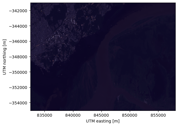
With no arguments, xarray takes care of creating the new figure and adding a
lot of the different plot elements, like axis labels and units.
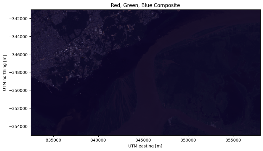
If we want more control over the plot, we must create a matplotlib figure and
axes separately and tell imshow to plot on those
instead:
fig, ax = plt.subplots(1, 1, figsize=(10, 6))

rgb.plot.imshow(ax=ax)

# The "long_name" of the composite is the band combination
ax.set_title(rgb.attrs["long_name"].title())

# Make sure pixels are square when plotting to avoid distortions
ax.set_aspect("equal")

plt.show()
It’s also possible to add a composite to an interactive ipyleaflet map using
xlandsat.plot_composite_leaflet:
xls.plot_composite_leaflet(rgb)
This composite looks bad because some very bright pixels in the city are making the majority of the other pixels have only a small share of the full range of available values. This can be mitigated by rescaling the intensity of the image to a smaller range of reflectance values.
Note
Using xarray.DataArray.plot instead of
xarray.DataArray.plot.imshow won’t work and will display histograms
instead.
Rescaling intensity (AKA contrast stretching)#
We rescale the intensities of a composite to a given reflectance range by
setting the rescale_to parameter when creating a composite. It takes a list
of the min and max reflectance values allowed. For this image, we can arrive at
the following values by trial and error until it looks nice:
rgb = xls.composite(scene, rescale_to=[0.01, 0.2])

# Pretty much the same plotting code
fig, ax = plt.subplots(1, 1, figsize=(10, 6))
rgb.plot.imshow(ax=ax)
ax.set_title(f"Rescaled {rgb.attrs['long_name'].title()}")
ax.set_aspect("equal")
plt.show()
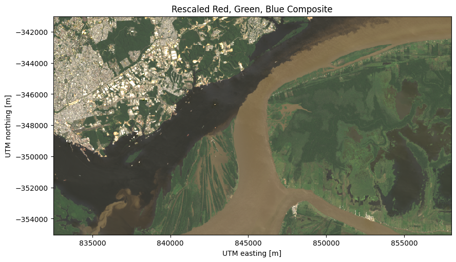
Notice that we can more clearly see the different colors of the forest and the rivers. However, it can still be a bit hard to distinguish between some of the water bodies and the forest in the right side of the scene. Other band combinations can generate composites that better highlight these features.
Note
The rescaling has to be done when creating the composite so that we can use min/max values in reflectance units. After a composite is created, the original range of values is lost and we’d have to specify the min/max between 0 and 255 instead.
Color infrared composites#
Another common type of composite is the color infrared (CIR) composites,
which uses the NIR, red, and green bands as the red, green, blue channels.
The added information of the NIR band helps highlight vegetation, which can
help us distinguish between the water and forest on the right.
Let’s make one by specifying
this band combination to xlandsat.composite to see what happens:
cir = xls.composite(
    scene, rescale_to=[0, 0.4], bands=("nir", "red", "green"),
)

fig, ax = plt.subplots(1, 1, figsize=(10, 6))
cir.plot.imshow(ax=ax)
ax.set_title(cir.attrs["long_name"].title())
ax.set_aspect("equal")
plt.show()
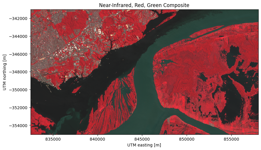
In this composite, the contrast between the forest and water bodies on the right are much clearer!
Composites highlighting fires#
When a fire is currently burning and producing smoke, it can be difficult to visualize the fire front in a regular RGB composite. For this, the SWIR and NIR bands can be very useful. A composite of SWIR, NIR, and blue can be useful to highlight the burned areas, ongoing fire, and vegetation. Let’s see what this looks like in our Corumbá, Brazil, sample data:
corumba = xls.load_scene(xls.datasets.fetch_corumba_after())
corumba_rgb = xls.adjust_l1_colors(
    xls.composite(corumba, rescale_to=(0, 0.2)),
    percentile=0,
)
corumba_fire = xls.composite(
    corumba, rescale_to=(0, 0.4), bands=["swir1", "nir", "blue"],
)

fig, axes = plt.subplots(1, 2, figsize=(10, 8), layout="constrained")
for ax, composite in zip(axes, [corumba_rgb, corumba_fire]):
    composite.plot.imshow(ax=ax)
    ax.set_title(rgb.attrs["long_name"])
    ax.set_aspect("equal")
plt.show()
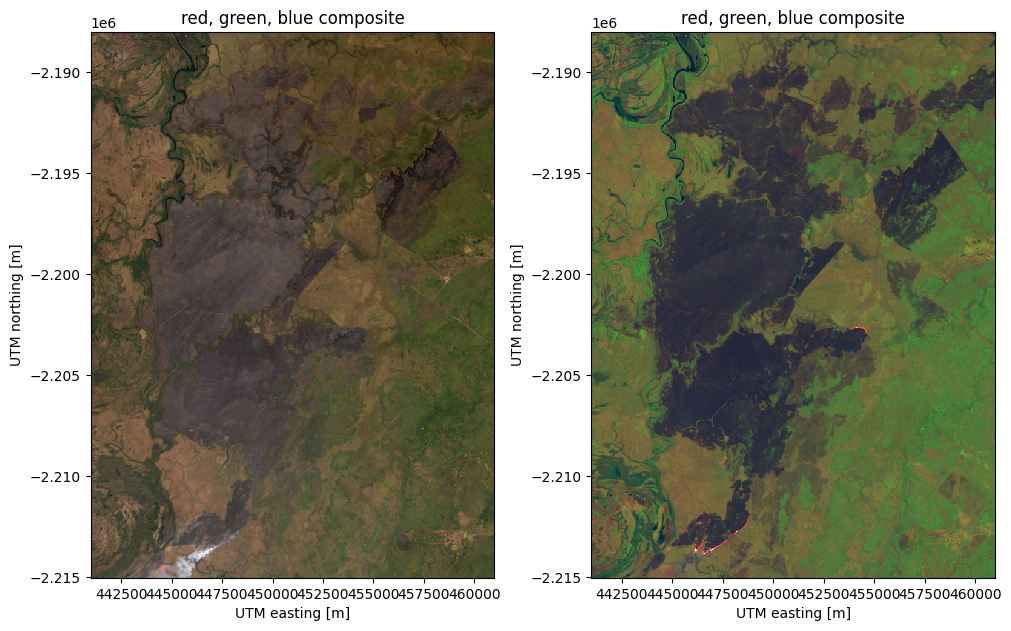
The burn scar can be seen in the RGB but there is smoke in the South and it’s not clear whether there are any active fires still burning. The SWIR/NIR/green composite highlights the active fires in bright red and can even show then through the smoke (which doesn’t reflect in the SWIR bands). This composite also highlights the difference between burned areas and preserved vegetation.
Other composites#
You can make pretty much any composite you’d like by passing the correct band
combination to xlandsat.composite.
For example, let’s make one with NIR as red, SWIR1 as green, and red as blue:
custom = xls.composite(
    scene, rescale_to=[0, 0.4], bands=("nir", "swir1", "red"),
)

fig, ax = plt.subplots(1, 1, figsize=(10, 6))
custom.plot.imshow(ax=ax)
ax.set_title(custom.attrs["long_name"].title())
ax.set_aspect("equal")
plt.show()
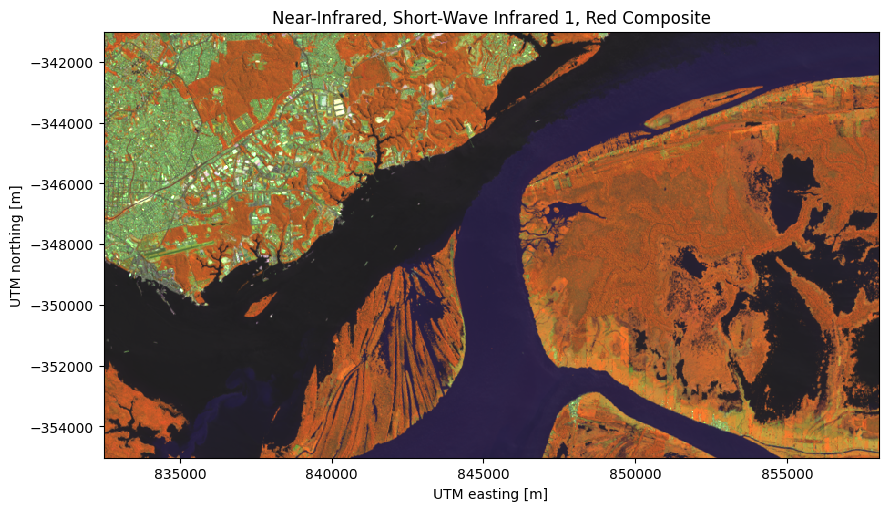
This particular composite is great at distinguishing between built structures in the city and along the canals (light green), the water ways (dark blue and purple), and the forest (orange).