Working with indices#
Indices calculated from multispectral satellite imagery are powerful ways to
quantitatively analyze these data.
They take advantage of different spectral properties of materials to
differentiate between them.
Many of these indices can be calculated with simple arithmetic operations.
So now that our data are in xarray.Dataset’s, it’s fairly easy to
calculate them.
Some commonly used indices are provided as functions in xlandsat but
any other index can be calculated using the power of xarray.
Here, we’ll see some examples of indices that can be calculated. First, we must import the required packages for the examples below.
import xlandsat as xls
import matplotlib.pyplot as plt
import numpy as np
NDVI#
As an example, we’ll use two scenes from before and after the
Brumadinho tailings dam disaster
to try to image and quantify the total area flooded by the damn collapse using
NDVI,
which is available in xlandsat.ndvi.
Trigger warning
This tutorial uses data from the tragic Brumadinho tailings dam disaster, in which over 250 people lost their lives. We use this dataset to illustrate the usefulness of remote sensing data for monitoring such disasters but we want to acknowledge its tragic human consequences. Some readers may find this topic disturbing and may not wish to read futher.
First, we must download the sample data and load the two scenes with
xlandsat.load_scene:
path_before = xls.datasets.fetch_brumadinho_before()
path_after = xls.datasets.fetch_brumadinho_after()
before = xls.load_scene(path_before)
after = xls.load_scene(path_after)
after
<xarray.Dataset> Size: 1MB
Dimensions:   (easting: 400, northing: 300)
Coordinates:
  * easting   (easting) float64 3kB 5.844e+05 5.844e+05 ... 5.963e+05 5.964e+05
  * northing  (northing) float64 2kB -2.232e+06 -2.232e+06 ... -2.223e+06
Data variables:
    blue      (northing, easting) float16 240kB 0.0686 0.07043 ... 0.0564
    green     (northing, easting) float16 240kB 0.1027 0.09839 ... 0.07043
    red       (northing, easting) float16 240kB 0.09778 0.09778 ... 0.06177
    nir       (northing, easting) float16 240kB 0.2988 0.2715 ... 0.2637 0.251
    swir1     (northing, easting) float16 240kB 0.2311 0.2274 ... 0.1608 0.142
    swir2     (northing, easting) float16 240kB 0.145 0.1442 ... 0.09961 0.08655
Attributes: (12/19)
    Conventions:                CF-1.8
    title:                      Landsat 8 scene from 2019-01-30 (path/row=218...
    digital_object_identifier:  https://doi.org/10.5066/P9OGBGM6
    origin:                     Image courtesy of the U.S. Geological Survey
    landsat_product_id:         LC08_L2SP_218074_20190130_20200829_02_T1
    processing_level:           L2SP
    ...                         ...
    ellipsoid:                  WGS84
    date_acquired:              2019-01-30
    scene_center_time:          12:57:09.1851220Z
    wrs_path:                   218
    wrs_row:                    74
mtl_file: GROUP = LANDSAT_METADATA_FILE\n GROUP = PROD...Let’s make RGB composites to get a sense of what these two scenes contain:
rgb_before = xls.composite(before, rescale_to=(0.03, 0.2))
rgb_after = xls.composite(after, rescale_to=(0.03, 0.2))

fig, axes = plt.subplots(2, 1, figsize=(10, 12), layout="tight")
for ax, rgb in zip(axes, [rgb_before, rgb_after]):
    rgb.plot.imshow(ax=ax)
    ax.set_title(rgb.attrs["title"])
    ax.set_aspect("equal")
plt.show()
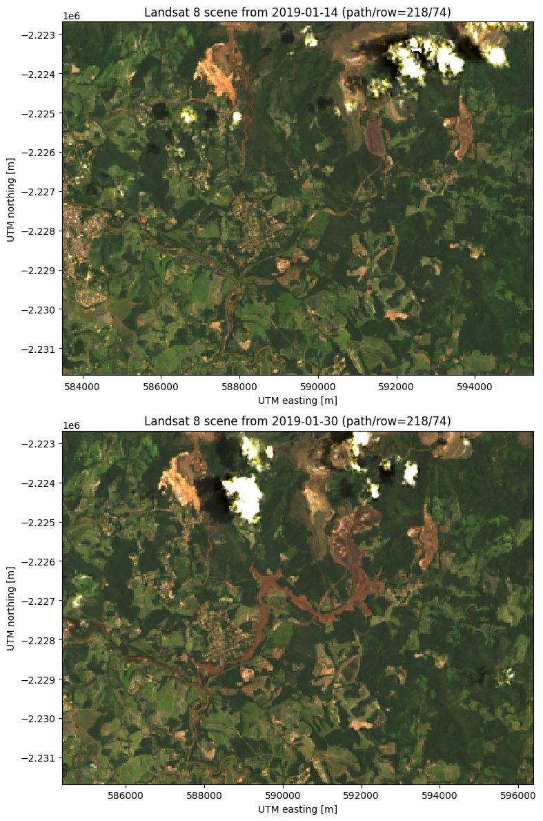
The dam is located at around 592000 east and -2225000 north. The after scene clearly shows all of the red mud that flooded the region to the southwest of the dam. Notice also the red tinge of the Paraopeba River in the after image as it was contaminated by the mud flow.
Tip
See Making composites for more information on what we did above.
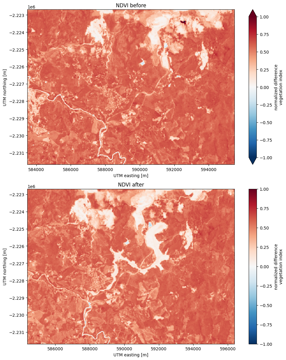
We can calculate the NDVI for these scenes to see if we can isolate the effect
of the flood following the dam collapse.
NDVI highlights vegetation, which we assume will have decreased in the after
scene due to the flood.
Calculating the NDVI is as simple as calling xlandsat.ndvi with the
scene as an argument:
ndvi_before = xls.ndvi(before)
ndvi_after = xls.ndvi(after)
ndvi_after
<xarray.DataArray 'ndvi' (northing: 300, easting: 400)> Size: 240kB
array([[0.5073, 0.4705, 0.4907, ..., 0.515 , 0.4946, 0.4565],
       [0.4277, 0.478 , 0.4817, ..., 0.4949, 0.5166, 0.5474],
       [0.37  , 0.4304, 0.441 , ..., 0.522 , 0.5786, 0.6226],
       ...,
       [0.57  , 0.594 , 0.595 , ..., 0.328 , 0.462 , 0.54  ],
       [0.5845, 0.5796, 0.583 , ..., 0.4995, 0.566 , 0.572 ],
       [0.61  , 0.5664, 0.5938, ..., 0.609 , 0.5903, 0.605 ]],
      shape=(300, 400), dtype=float16)
Coordinates:
  * easting   (easting) float64 3kB 5.844e+05 5.844e+05 ... 5.963e+05 5.964e+05
  * northing  (northing) float64 2kB -2.232e+06 -2.232e+06 ... -2.223e+06
Attributes: (12/20)
    long_name:                  normalized difference vegetation index
    Conventions:                CF-1.8
    title:                      Landsat 8 scene from 2019-01-30 (path/row=218...
    digital_object_identifier:  https://doi.org/10.5066/P9OGBGM6
    origin:                     Image courtesy of the U.S. Geological Survey
    landsat_product_id:         LC08_L2SP_218074_20190130_20200829_02_T1
    ...                         ...
    ellipsoid:                  WGS84
    date_acquired:              2019-01-30
    scene_center_time:          12:57:09.1851220Z
    wrs_path:                   218
    wrs_row:                    74
mtl_file: GROUP = LANDSAT_METADATA_FILE\n GROUP = PROD...And add some extra metadata for xarray to find when making plots:
ndvi_before.attrs["title"] = "NDVI before"
ndvi_after.attrs["title"] = "NDVI after"
Now we can make pseudo-color plots of the NDVI from before and after the disaster:
fig, axes = plt.subplots(2, 1, figsize=(10, 12), layout="tight")
for ax, ndvi in zip(axes, [ndvi_before, ndvi_after]):
    # Limit the scale to [-1, +1] so the plots are easier to compare
    ndvi.plot(ax=ax, vmin=-1, vmax=1, cmap="RdBu_r")
    ax.set_title(ndvi.attrs["title"])
    ax.set_aspect("equal")
plt.show()
Tracking differences#
An advantage of having our data in xarray.DataArray format is that we
can perform coordinate-aware calculations. This means that taking the
difference between our two arrays will take into account the coordinates of
each pixel and only perform the operation where the coordinates align.
We can calculate the change in NDVI from one scene to the other by taking the difference:
ndvi_change = ndvi_before - ndvi_after

# Add som metadata for xarray
ndvi_change.name = "ndvi_change"
ndvi_change.attrs["long_name"] = "NDVI change"
ndvi_change.attrs["title"] = (
    f"NDVI change between {before.attrs['date_acquired']} and "
    f"{after.attrs['date_acquired']}"
)
ndvi_change
<xarray.DataArray 'ndvi_change' (northing: 300, easting: 370)> Size: 222kB
array([[ 0.05908 ,  0.06323 ,  0.0542  , ...,  0.004395, -0.009766,
         0.07324 ],
       [ 0.0498  ,  0.07764 ,  0.07495 , ...,  0.0957  ,  0.012695,
         0.003906],
       [-0.010254,  0.11743 ,  0.0747  , ...,  0.03125 ,  0.01807 ,
         0.04004 ],
       ...,
       [-0.000977,  0.01123 ,  0.000977, ...,  0.00928 ,  0.01367 ,
         0.00708 ],
       [ 0.00879 ,  0.02344 ,  0.01318 , ...,  0.006836,  0.00586 ,
         0.001221],
       [-0.01221 ,  0.02637 ,  0.006836, ...,  0.01343 ,  0.01221 ,
         0.0105  ]], shape=(300, 370), dtype=float16)
Coordinates:
  * easting   (easting) float64 3kB 5.844e+05 5.844e+05 ... 5.954e+05 5.955e+05
  * northing  (northing) float64 2kB -2.232e+06 -2.232e+06 ... -2.223e+06
Attributes:
    long_name:  NDVI change
title: NDVI change between 2019-01-14 and 2019-01-30Did you notice?
The keen-eyed among you may have noticed that the number of points along
the "easting" dimension has decreased. This is because xarray
only makes the calculations for pixels where the two scenes coincide. In
this case, there was an East-West shift between scenes but our calculations
take that into account.
Now lets plot the difference:
fig, ax = plt.subplots(1, 1, figsize=(10, 6))
ndvi_change.plot(ax=ax, vmin=-1, vmax=1, cmap="PuOr")
ax.set_aspect("equal")
ax.set_title(ndvi_change.attrs["title"])
plt.show()
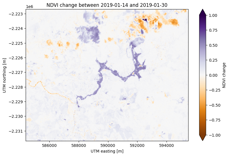
There’s some noise in the cloudy areas of both scenes in the northeast but otherwise this plots highlights the area affected by flooding from the dam collapse in purple at the center.
Estimating area#
One things we can do with indices and their differences in time is calculated area estimates. If we know that the region of interest has index values within a given value range, the area can be calculated by counting the number of pixels within that range (a pixel in Landsat 8/9 scenes is 30 x 30 = 900 m²).
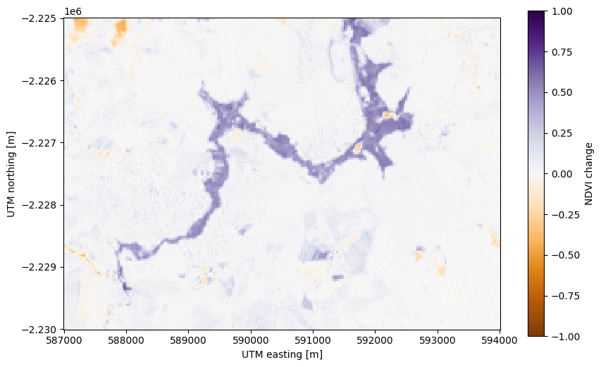
First, let’s slice our NDVI difference to just the flooded area to avoid the
effect of the clouds in North. We’ll use the xarray.DataArray.sel
method to slice using the UTM coordinates of the scene:
flood = ndvi_change.sel(
    easting=slice(587000, 594000),
    northing=slice(-2230000, -2225000),
)

fig, ax = plt.subplots(1, 1, figsize=(10, 6))
flood.plot(ax=ax, vmin=-1, vmax=1, cmap="PuOr")
ax.set_aspect("equal")
plt.show()
Now we can create a mask of the flood area by selecting pixels that have a high
NDVI difference. Using a > comparison (or any other logical operator in
Python), we can create a boolean (True or False)
xarray.DataArray as our mask:
# Threshold value determined by trial-and-error
flood_mask = flood > 0.3

# Add some metadata for xarray
flood_mask.attrs["long_name"] = "flood mask"

flood_mask
<xarray.DataArray 'ndvi_change' (northing: 167, easting: 234)> Size: 39kB
array([[False, False, False, ..., False, False, False],
       [False, False, False, ..., False, False, False],
       [False, False, False, ..., False, False, False],
       ...,
       [False, False, False, ..., False, False, False],
       [False, False, False, ..., False, False, False],
       [False, False, False, ..., False, False, False]], shape=(167, 234))
Coordinates:
  * easting   (easting) float64 2kB 5.87e+05 5.87e+05 ... 5.94e+05 5.94e+05
  * northing  (northing) float64 1kB -2.23e+06 -2.23e+06 ... -2.225e+06
Attributes:
long_name: flood maskPlotting boolean arrays will use 1 to represent True and 0 to represent
False:
fig, ax = plt.subplots(1, 1, figsize=(10, 6))
flood_mask.plot(ax=ax, cmap="gray")
ax.set_aspect("equal")
ax.set_title("Flood mask")
plt.show()
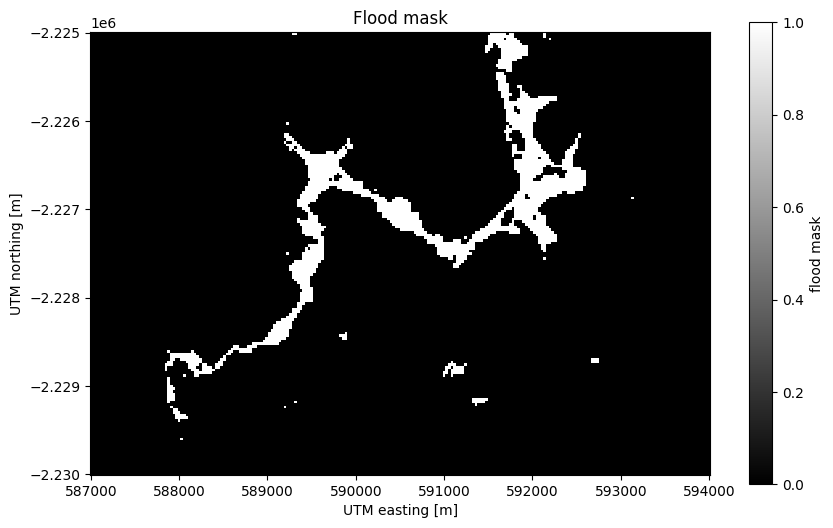
See also
Notice that our mask isn’t perfect. There are little bloobs classified as flood pixels that are clearly outside the flood region. For more sophisticated analysis, see the image segmentation methods in scikit-image.
Counting the number of True values is as easy as adding all of the boolean
values (remember that True corresponds to 1 and False to 0), which
we’ll do with xarray.DataArray.sum:
flood_pixels = flood_mask.sum().values
print(flood_pixels)
2095
Note
We use .values above because sum returns an
xarray.DataArray with a single value instead of the actual number.
This is usually not a problem but it looks ugly when printed, so we grab
the number with .values.
Finally, the flood area is the number of pixels multiplied by the area of each pixel (30 x 30 m²):
flood_area = flood_pixels * 30**2

print(f"Flooded area is approximately {flood_area:.0f} m²")
Flooded area is approximately 1885500 m²
Values in m² are difficult to imagine so a good way to communicate these numbers is to put them into real-life context. In this case, we can use the football pitches as a unit that many people will understand:
flood_area_pitches = flood_area / 7140

print(f"Flooded area is approximately {flood_area_pitches:.0f} football pitches")
Flooded area is approximately 264 football pitches
Warning
This is a very rough estimate! The final value will vary greatly if you change the threshold used to generate the mask (try it yourself). For a more thorough analysis of the disaster using remote-sensing data, see Silva Rotta et al. (2020).
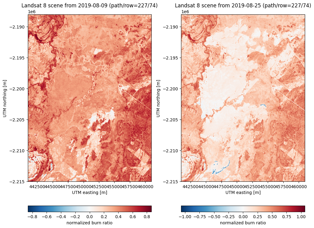
NBR#
The Normalized Burn Ratio is a useful tool to assess areas affected by recent fires. The NBR takes advantage of the relatively high reflectivity of burned areas in the short-wave infrared (SWIR) range when compared with vegetated areas. It’s defined as
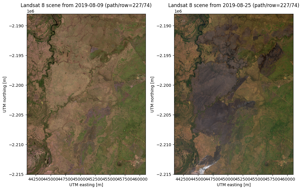
As an example, we can use our sample data from a fire that happened in near the city of Corumbá, Brazil. The sample scene is generated from Level 1 Landsat 8 data. It contains only a section of the fire and we have scenes from before the fire and from the very end of the fire.
before = xls.load_scene(xls.datasets.fetch_corumba_before())
after = xls.load_scene(xls.datasets.fetch_corumba_after())
after
<xarray.Dataset> Size: 7MB
Dimensions:   (easting: 667, northing: 901)
Coordinates:
  * easting   (easting) float64 5kB 4.41e+05 4.41e+05 ... 4.61e+05 4.61e+05
  * northing  (northing) float64 7kB -2.215e+06 -2.215e+06 ... -2.188e+06
Data variables:
    blue      (northing, easting) float16 1MB 0.09131 0.0907 ... 0.08728 0.08887
    green     (northing, easting) float16 1MB 0.07117 0.07007 ... 0.06909
    red       (northing, easting) float16 1MB 0.06006 0.05896 ... 0.06104
    nir       (northing, easting) float16 1MB 0.1149 0.1099 ... 0.07996 0.07629
    swir1     (northing, easting) float16 1MB 0.06018 0.05139 ... 0.07581
    swir2     (northing, easting) float16 1MB 0.03015 0.02515 ... 0.07129 0.0658
Attributes: (12/19)
    Conventions:                CF-1.8
    title:                      Landsat 8 scene from 2019-08-25 (path/row=227...
    digital_object_identifier:  https://doi.org/10.5066/P975CC9B
    origin:                     Image courtesy of the U.S. Geological Survey
    landsat_product_id:         LC08_L1TP_227074_20190825_20200826_02_T1
    processing_level:           L1TP
    ...                         ...
    ellipsoid:                  WGS84
    date_acquired:              2019-08-25
    scene_center_time:          13:53:10.8714120Z
    wrs_path:                   227
    wrs_row:                    74
mtl_file: GROUP = LANDSAT_METADATA_FILE\n GROUP = PROD...Let’s make RGB composites to get a sense of what these two scenes contain:
rgb_before = xls.adjust_l1_colors(
    xls.composite(before, rescale_to=(0, 0.2)),
    percentile=0,
)
rgb_after = xls.adjust_l1_colors(
    xls.composite(after, rescale_to=(0, 0.2)),
    percentile=0,
)

fig, axes = plt.subplots(1, 2, figsize=(10, 8), layout="constrained")
for ax, rgb in zip(axes, [rgb_before, rgb_after]):
    rgb.plot.imshow(ax=ax)
    ax.set_title(rgb.attrs["title"])
    ax.set_aspect("equal")
plt.show()
Now we can calculate the NBR for before and after:
nbr_before = xls.nbr(before)
nbr_after = xls.nbr(after)

fig, axes = plt.subplots(1, 2, figsize=(10, 8), layout="constrained")
for ax, nbr in zip(axes, [nbr_before, nbr_after]):
    nbr.plot.imshow(ax=ax, cbar_kwargs=dict(orientation="horizontal"))
    ax.set_title(nbr.attrs["title"])
    ax.set_aspect("equal")
plt.show()
A useful metric to better visualize the extent of the fires and to even classify the burn intensity is the dNBR, which can be calculated as:
dnbr = nbr_before - nbr_after

fig, axes = plt.subplots(1, 2, figsize=(10, 7), layout="constrained")
rgb.plot.imshow(ax=axes[0])
dnbr.plot.imshow(ax=axes[1], cbar_kwargs=dict(orientation="horizontal"))
for ax in axes:
    ax.set_aspect("equal")
plt.show()
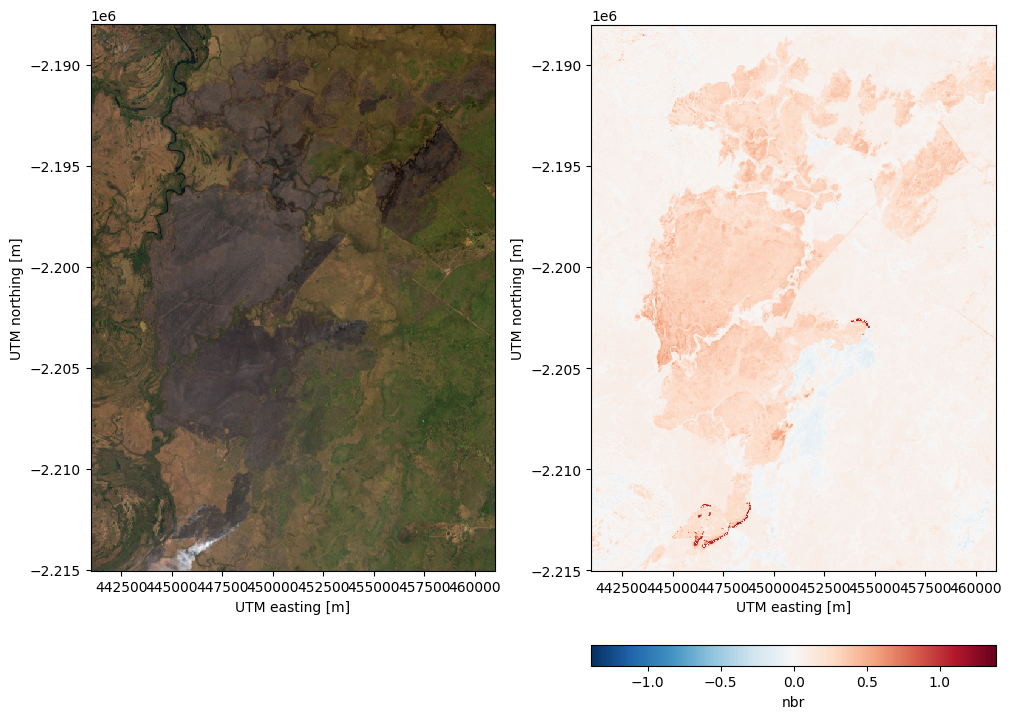
The dNBR values > 0.1 indicate the areas that have been burned. The bright red parts of the dNBR image above reflect the ongoing fire that was still burning in the area.
Calculating your own indices#
Calculating other indices will is relatively straight forward since most of them only involve arithmetic operations on different bands. As an example, let’s calculate and plot the Modified Soil Adjusted Vegetation Index (MSAVI) for our Manaus, Brazil, sample data:
scene = xls.load_scene(xls.datasets.fetch_manaus())

msavi = 0.5 * (
    2 * scene.nir + 1
    - np.sqrt((2 * scene.nir + 1) * 2 - 8 * (scene.nir - scene.red))
)
msavi.name = "msavi"
msavi.attrs["long_name"] = "modified soil adjusted vegetation index"

# Plot an RGB as well for comparison
rgb = xls.composite(scene, rescale_to=[0.02, 0.2])

fig, axes = plt.subplots(2, 1, figsize=(10, 9.75), layout="constrained")
rgb.plot.imshow(ax=axes[0])
msavi.plot(ax=axes[1], vmin=-0.5, vmax=0.5, cmap="RdBu_r")
axes[0].set_title("Manaus, Brazil")
for ax in axes:
    ax.set_aspect("equal")
plt.show()
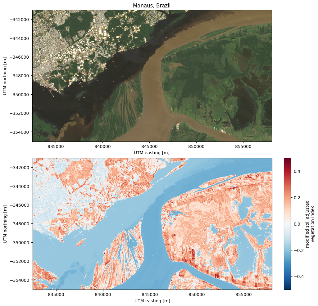
With this same logic, you could calculate any other index.